Change.org Impact Page (2014)
I was asked to re-envision a new impact page for Change.org, which focuses on the story of their success as the go-to platform for petitioning for change all over the world.


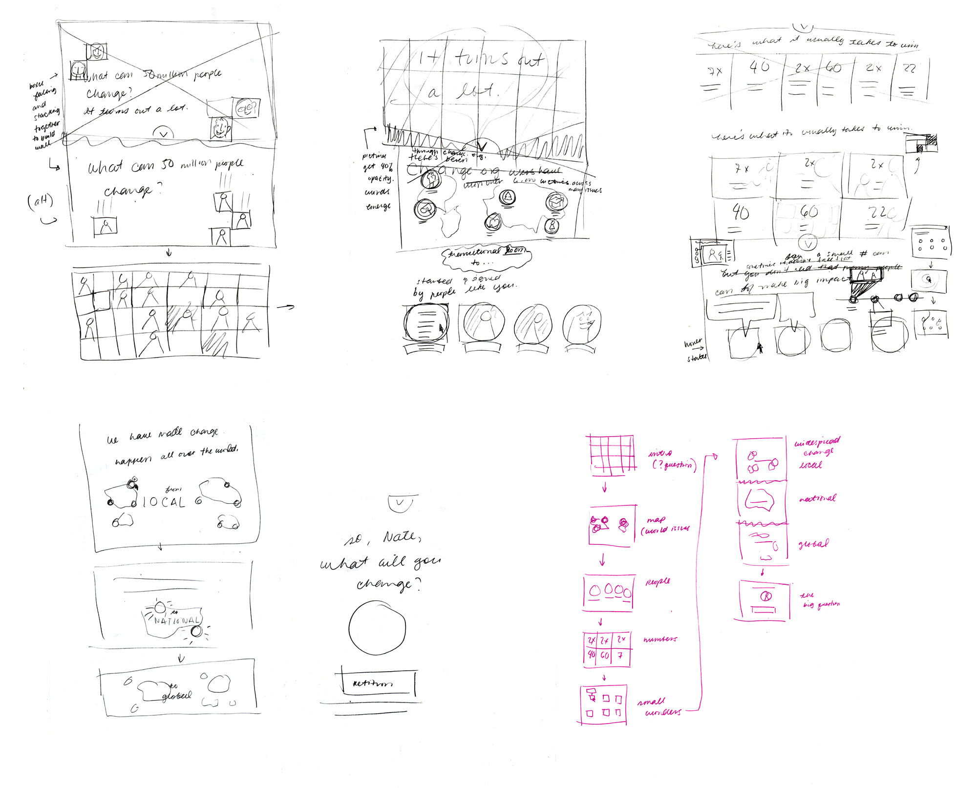
My process involved analyzing the current page and seeing how the use of typographic contrasts, broader range of color, use of iconography, and transitional effects can further express Change.org's story in a visually engaging way. Sketching out the content and story flow, as well as focusing on a more conversational tone throughout the page helped tie in the story together.
Desktop Site

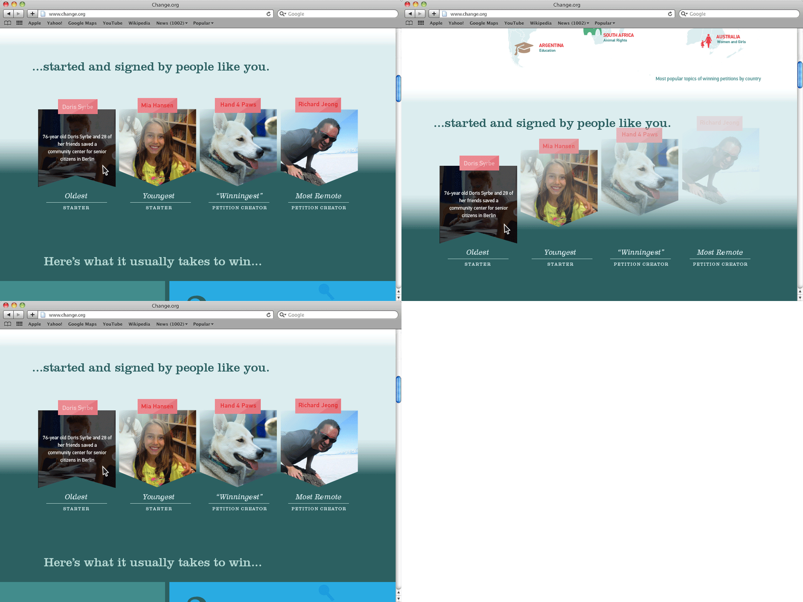
Once you visit the landing page, you are asked, "What can 50 million people change?" alluding to the 50 million user base at Change.org. The site then begins to speak about the range of different causes that people have participated in all over the world, the different kinds of people that started winning petitions, what it takes for a petition to win, and several examples of victories won from the local, national, and global scale. In the end, a personalized call-to-action invites the user to start their petition for change.

Mobile UX Site
The challenges that were considered during the development for the mobile UX site was the limitation of space, and with plenty of stories to share, how can we give each story its moment without having the user scroll endlessly into the ether? Each section is condensed in a way that retains the original UX design of the website, and uses a swipe left-to-right function so that the user may read through every story at their own pace without being inundated with too much information and text at once.

