Green Owl App
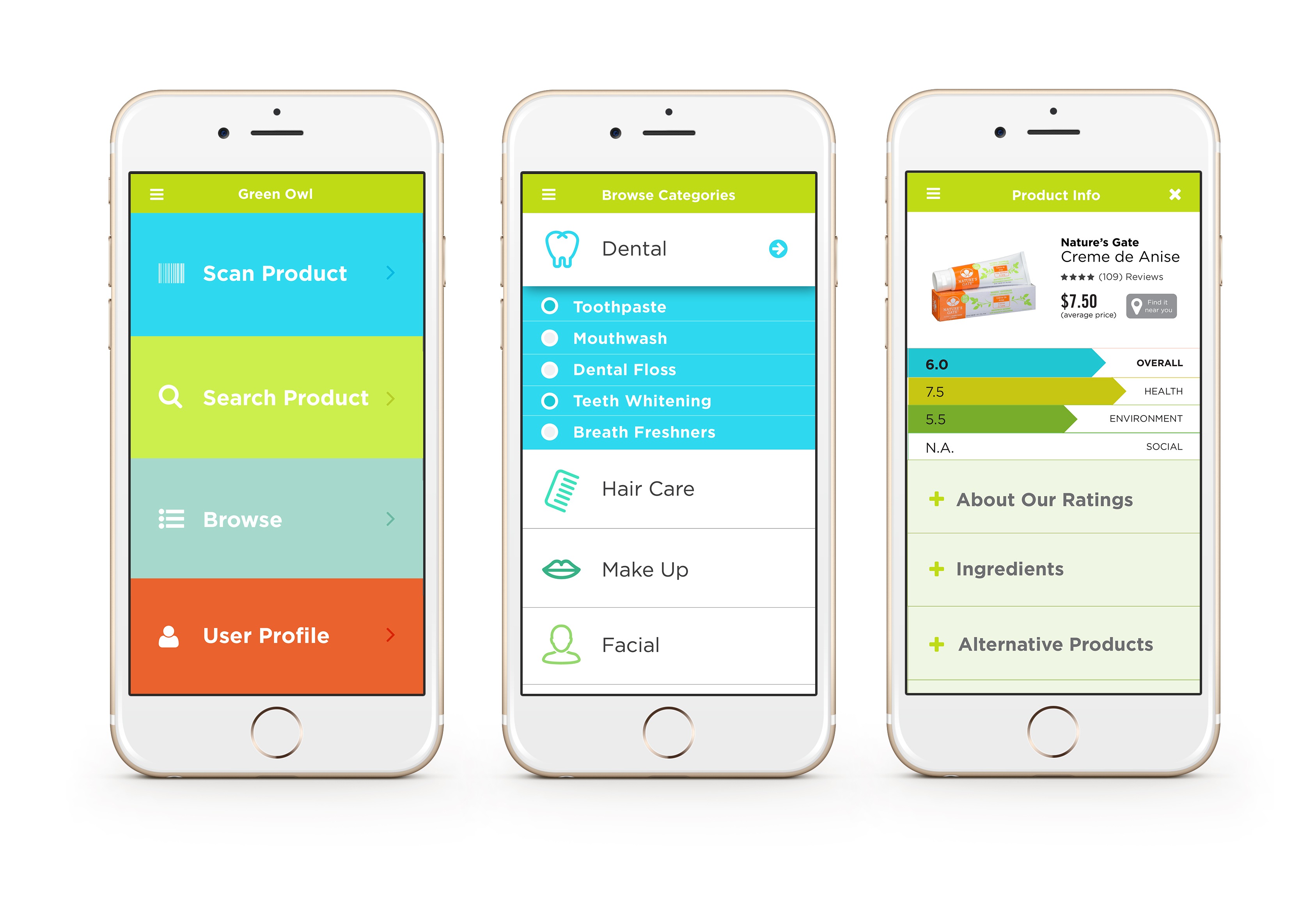
Green Owl is an app that helps you make educated decisions on the products you buy. It’s a go-to guide that tells you information based on ethical issues you care about, allowing you to shop smarter by attaining the best products and participating in the conscious consumption movement that benefits the greater good.
RELEASED
2015
ROLE
User Interviews,
User Journey Mapping, Wireframing, Prototyping, Hi-fidelity MockupTOOLS
Adobe Illustrator, Invision.
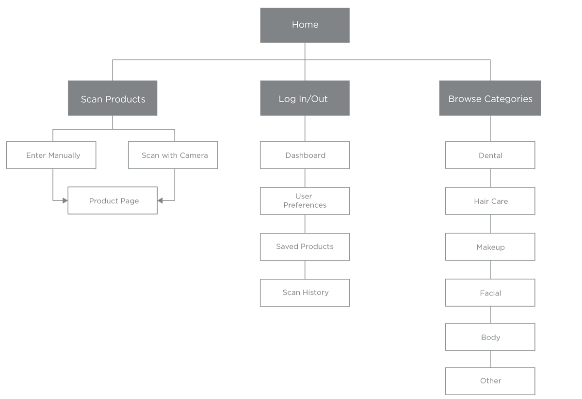
Content Architecture: App Map
Green Owl’s functionalities include the users’ ability to scan products they find at hand, browse through different personal care products found in the app’s database, and access their dashboard to view products they've saved for later. These functionalities are represented as 3 main branches in the app map.
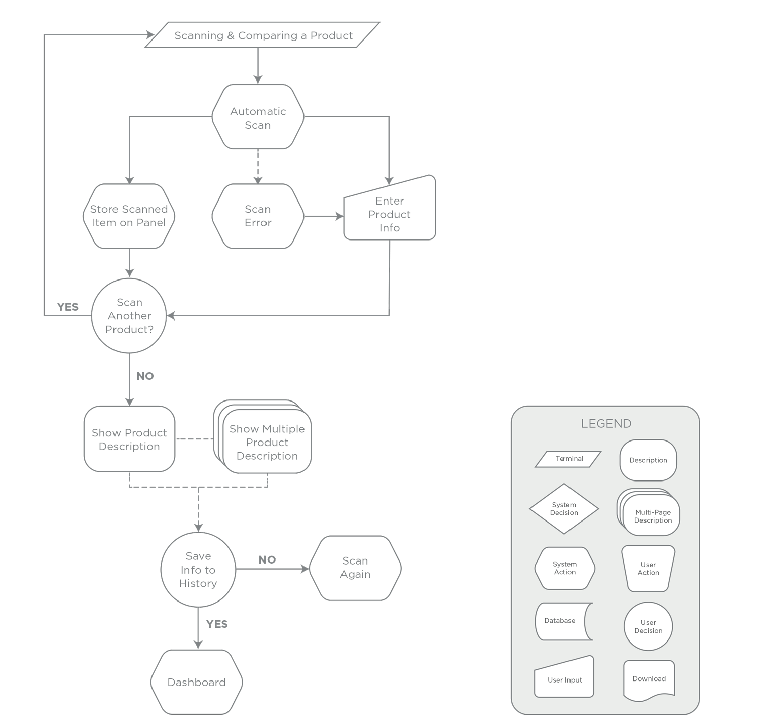
User Flow: Scanning a Product
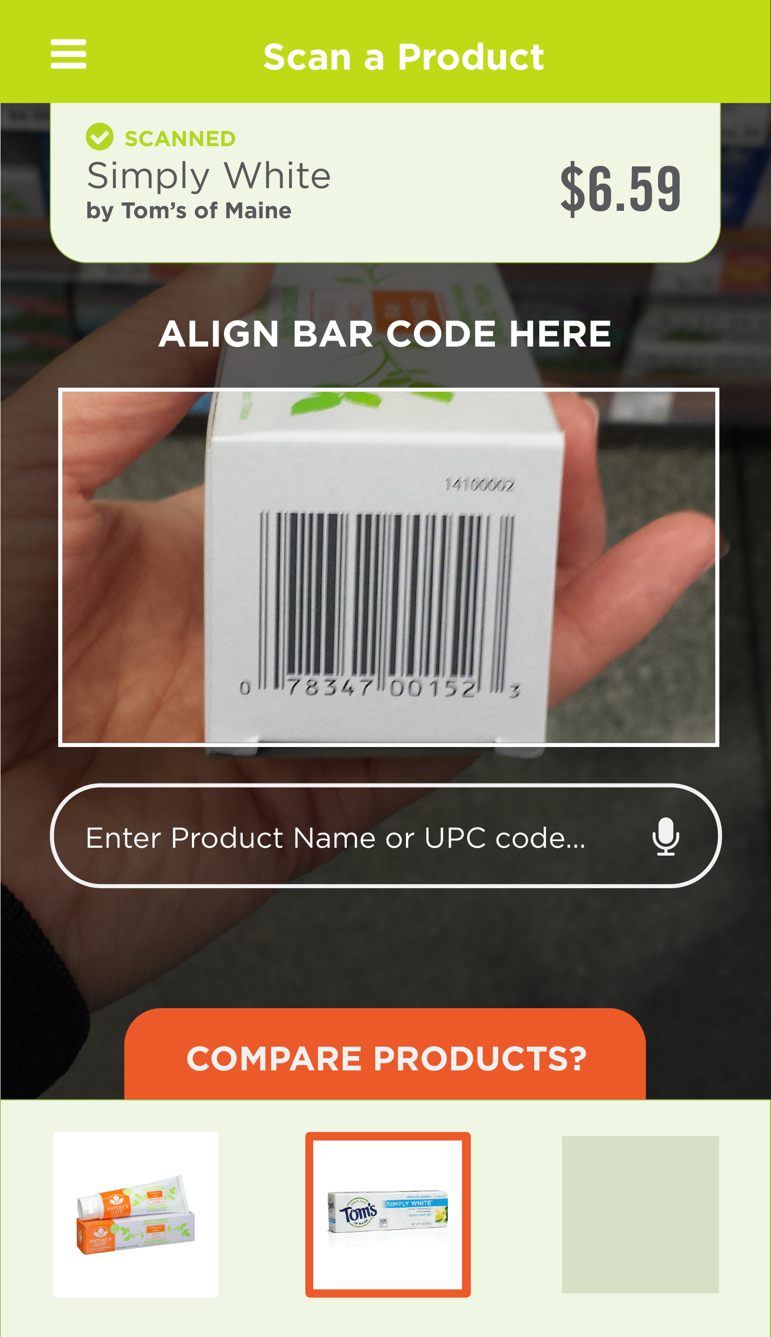
Green Owl’s initial functionality is its scanner. The app allows shoppers on the go to quickly find information about a product they want to buy by simply scanning a product’s barcode. Once a product is scanned, the app asks the user to see the information, or gives the option of scanning another product to compare their information side by side. After viewing the items information, the user then has the option to save products they intend to buy, or the user can also scan again and repeat the process.
Wireframes
The wireframes for the app as well as the look and feel were built in tandem. This allowed us to tackle the user-interface design on a content/functionality as well as a branding standpoint. Eventually, it didn't prove to be a seamless process, realizing that it's best to work on one problem at a time. It did, however, allowed us to quickly identify interactions that needed to be reconsidered, as well as visual elements that needed to be reworked in order to be more cohesive to the overall interface.
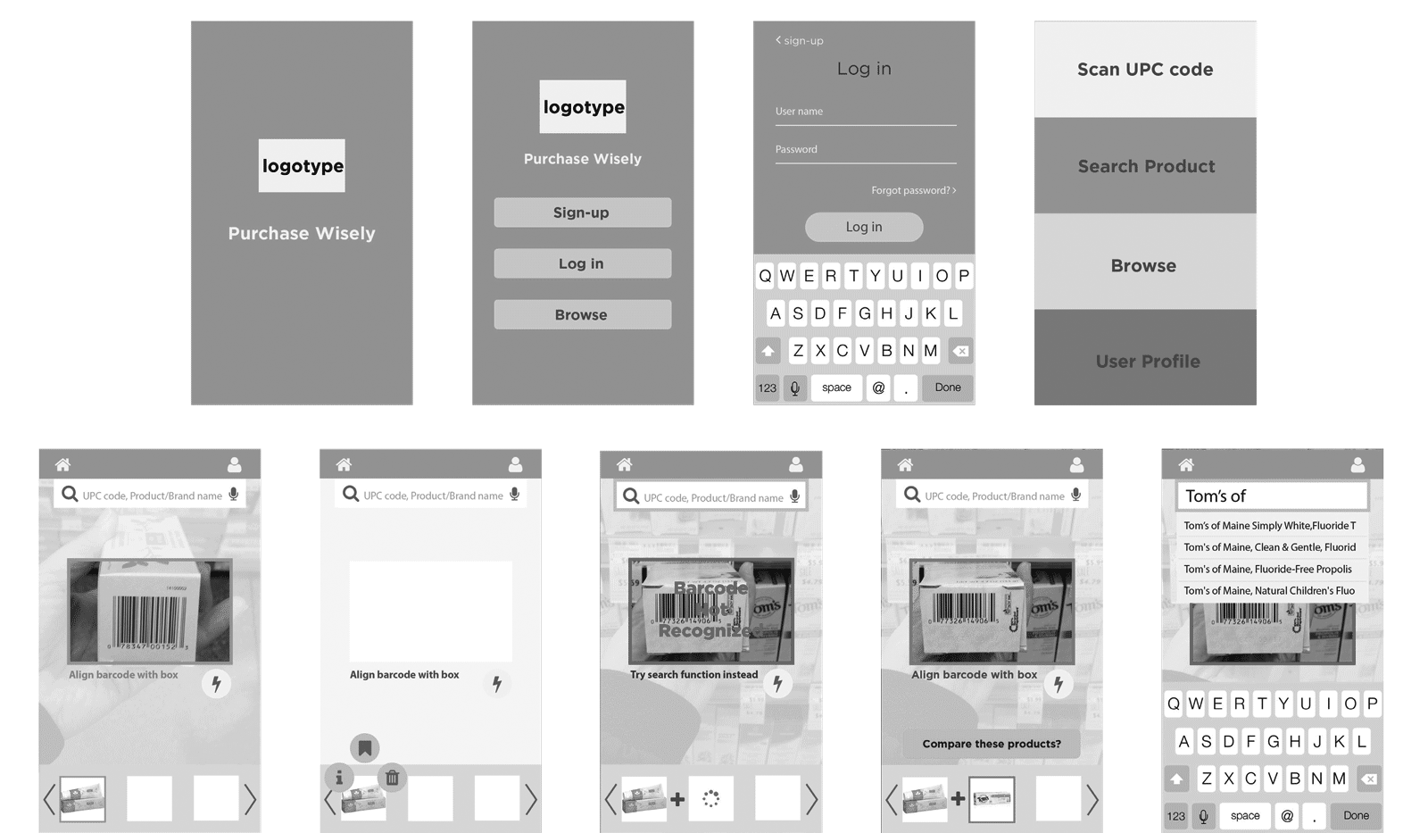
Scanning Tool and Barcode Read Error
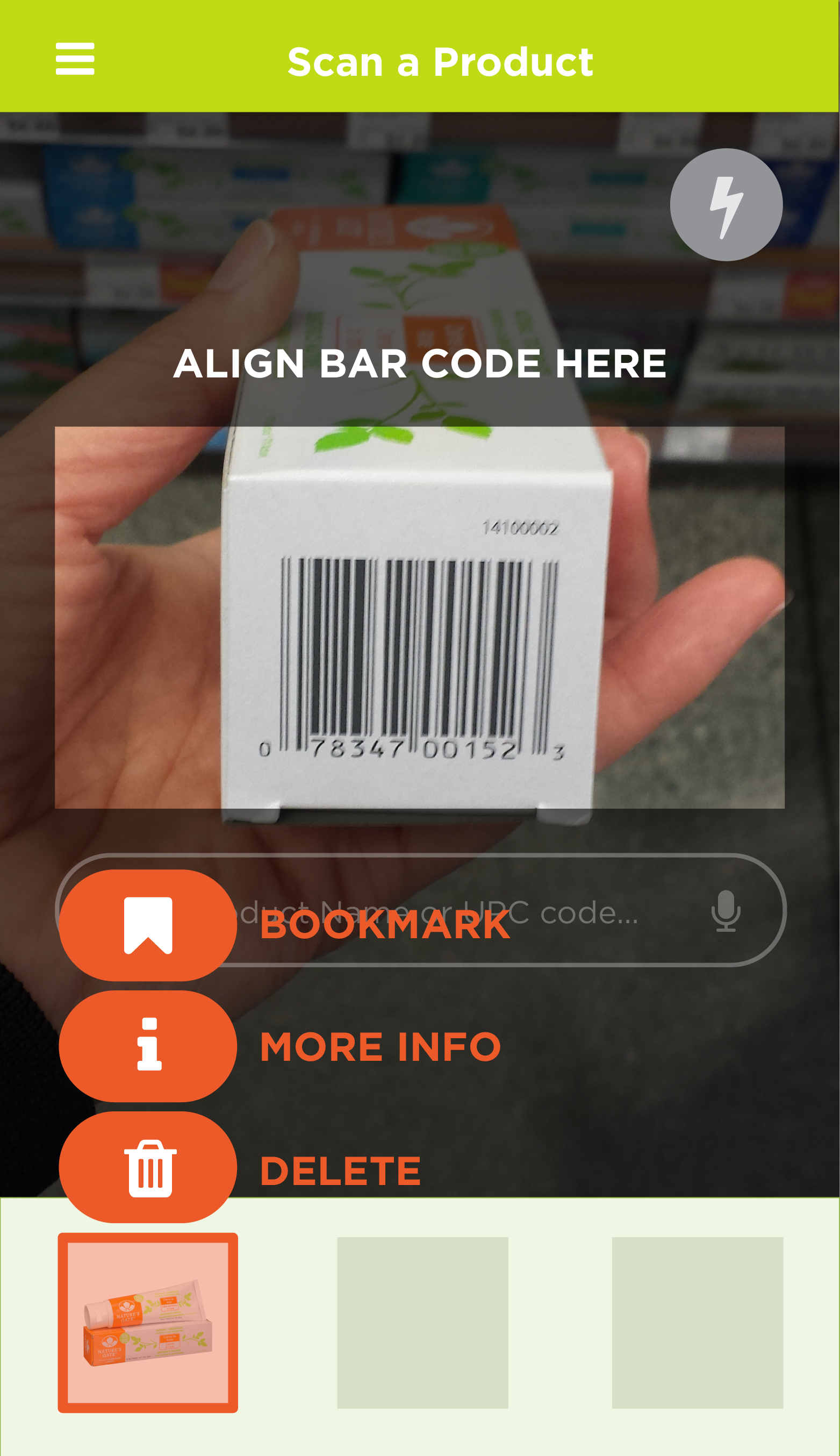
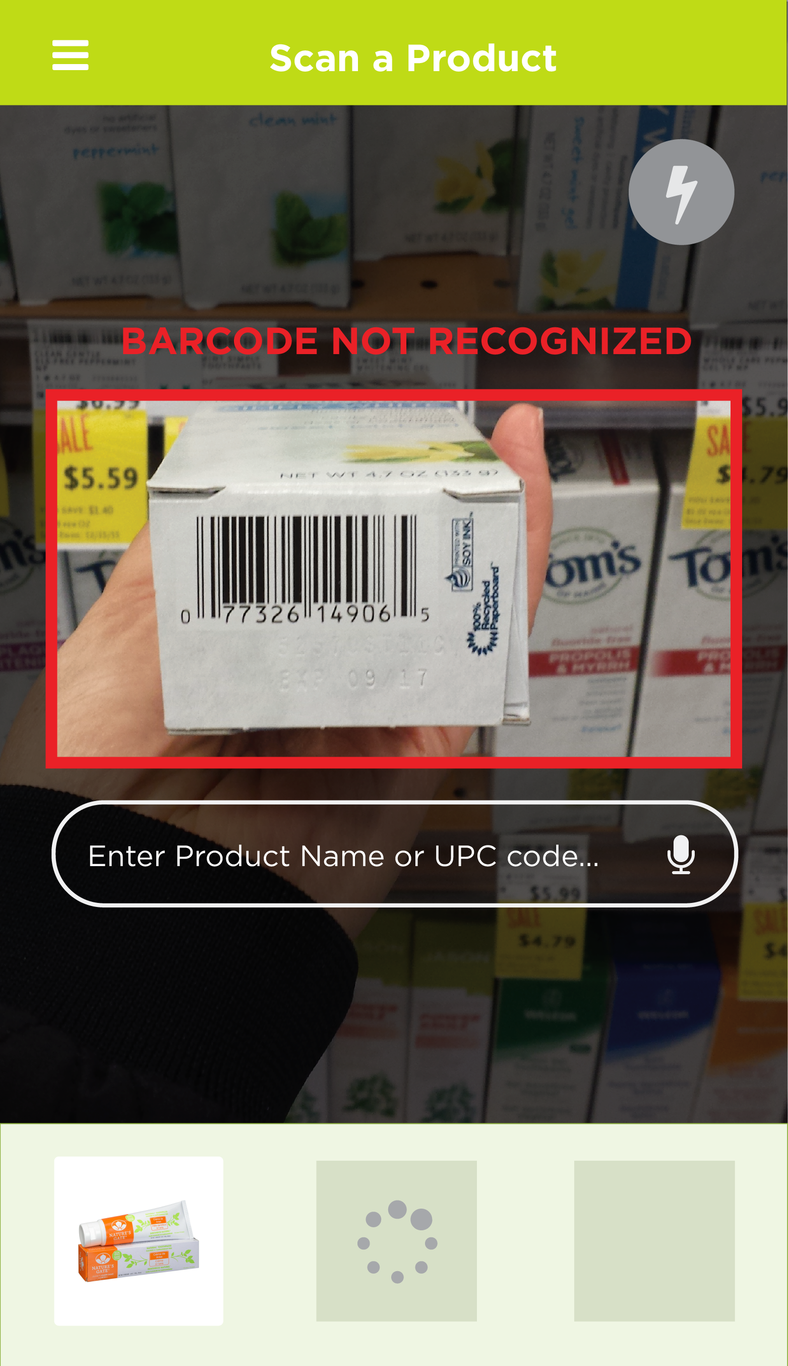
A clear barcode scan won’t always occur, especially if the shopper is in a rush. If the scan fails to recognize the bar code of the product, Green Owl lets the user know, and an option to type in the correct product info becomes available.
|
|
|

|
|
| 1 | 2 | 3 | 4 | 5 |
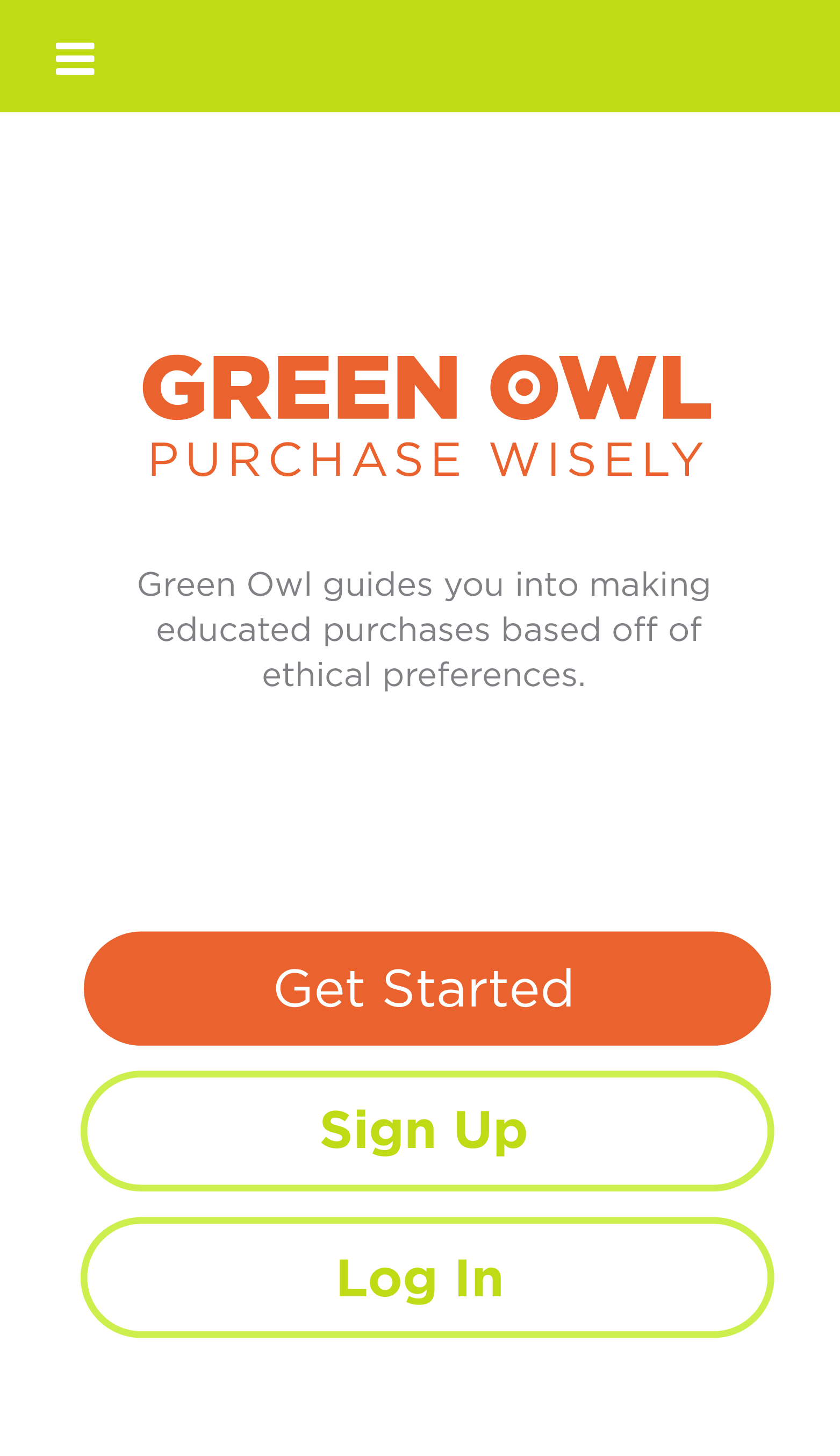
| Log In Screen | 'Tap & Hold' scanned item's icon to access actions | Read Error | By tapping on Text Box, user can enter suggested products | After product successfully registers, the app confirms the scan and provides the option to compare more than one product |
Onboarding: Selecting Preferences
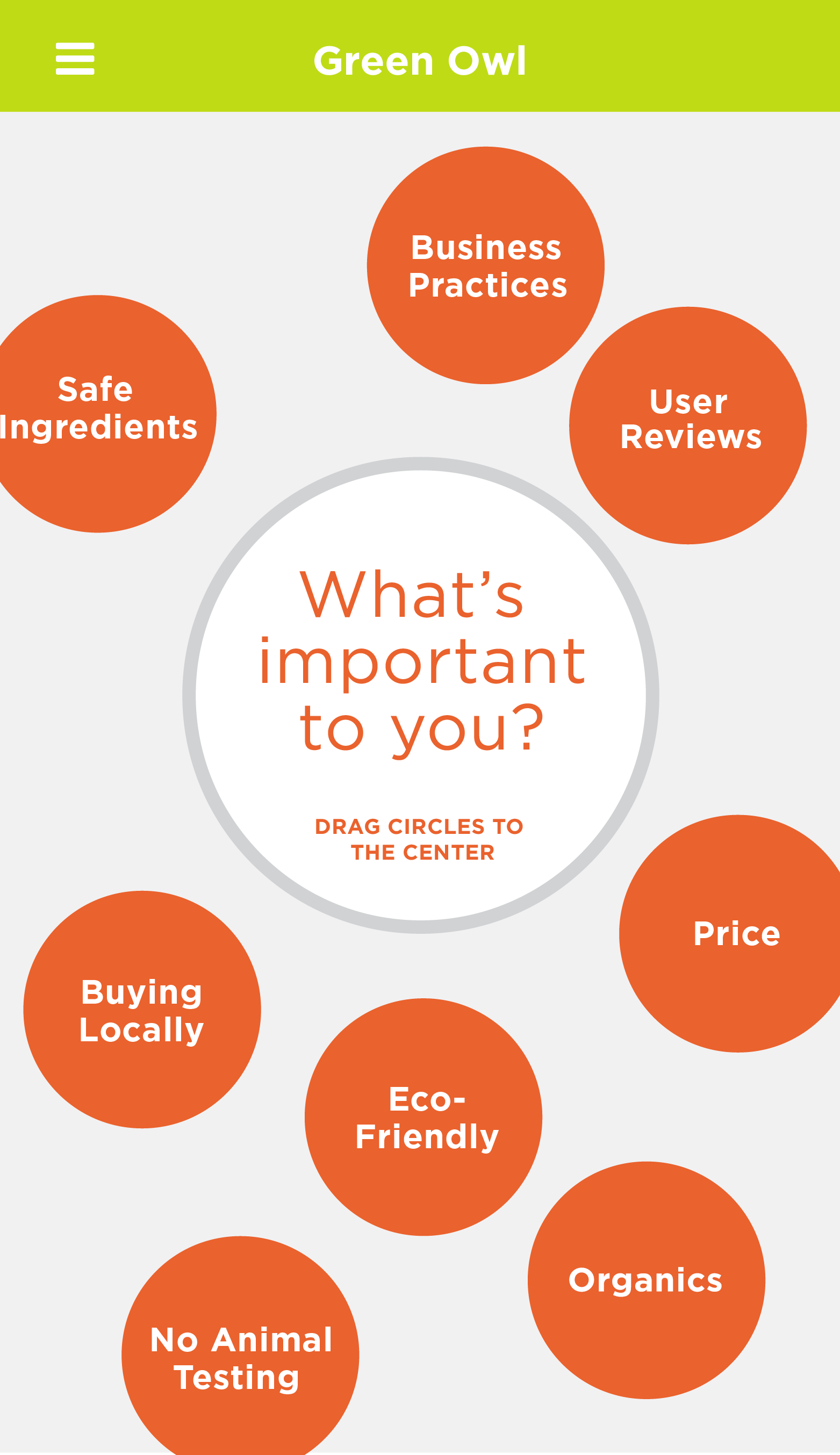
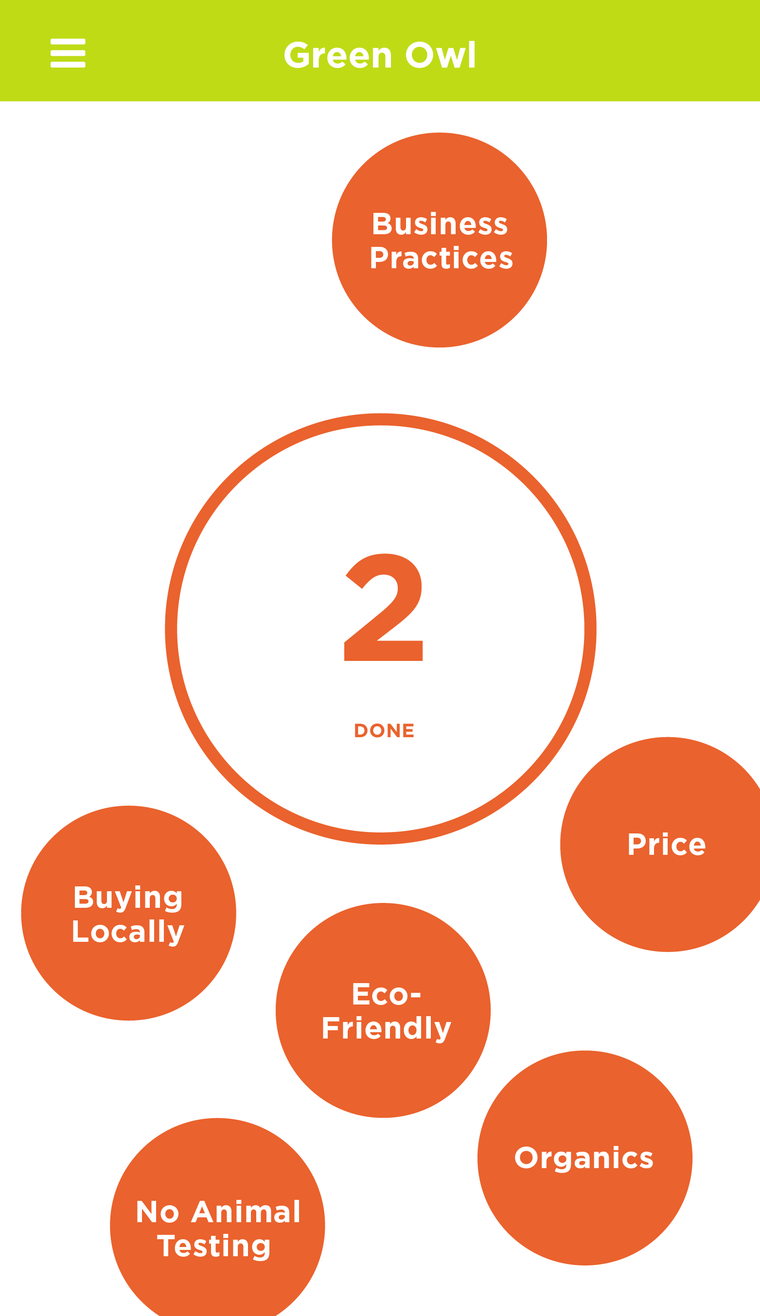
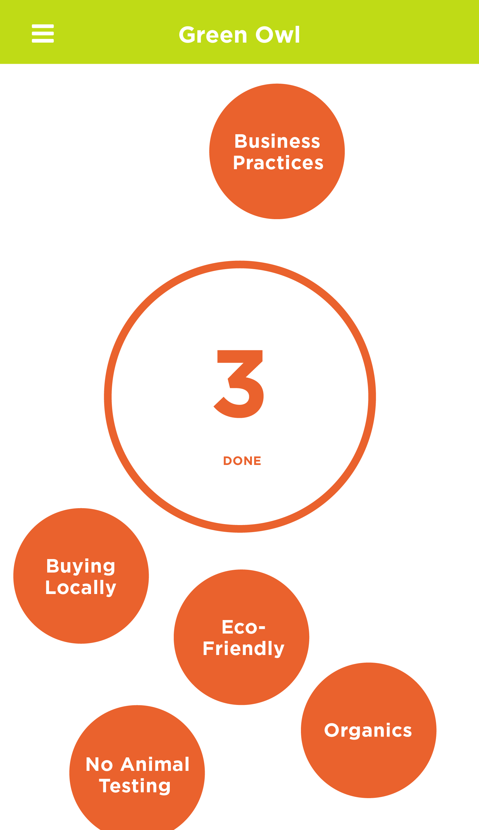
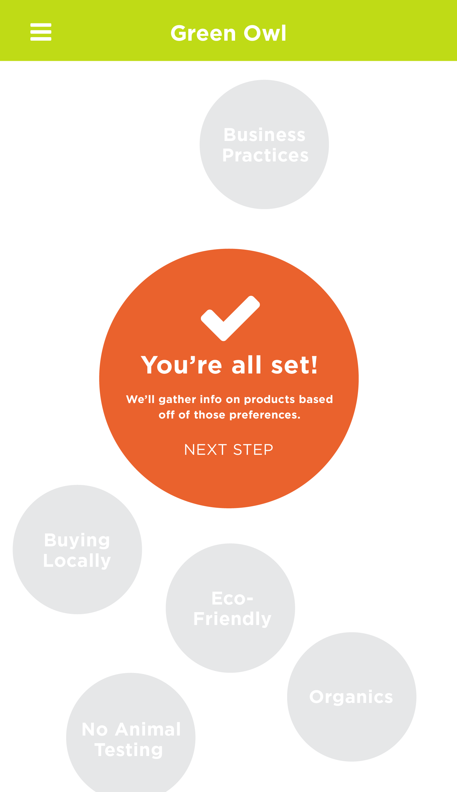
As a team, we wanted an onboarding process that featured an engaging and unconventional interaction for the user the first time they sign up. The initial on boarding sequence allows you to select different bubbles representing different issues, drag them to the center, then have the user confirm by clicking 'Done'. This process filters the kind of information that Green Owl will display for each product that the user scans or searches for.
|

|
|
|
|
| 1 | 2 | 3 | 4 | 5 |
| Ethical Issues are displayed | User selects "Safe Ingredients" | User selects "User Reviews" | User selects "Price" | Confirmation Screen |
Browsing Categories & Comparison Tool
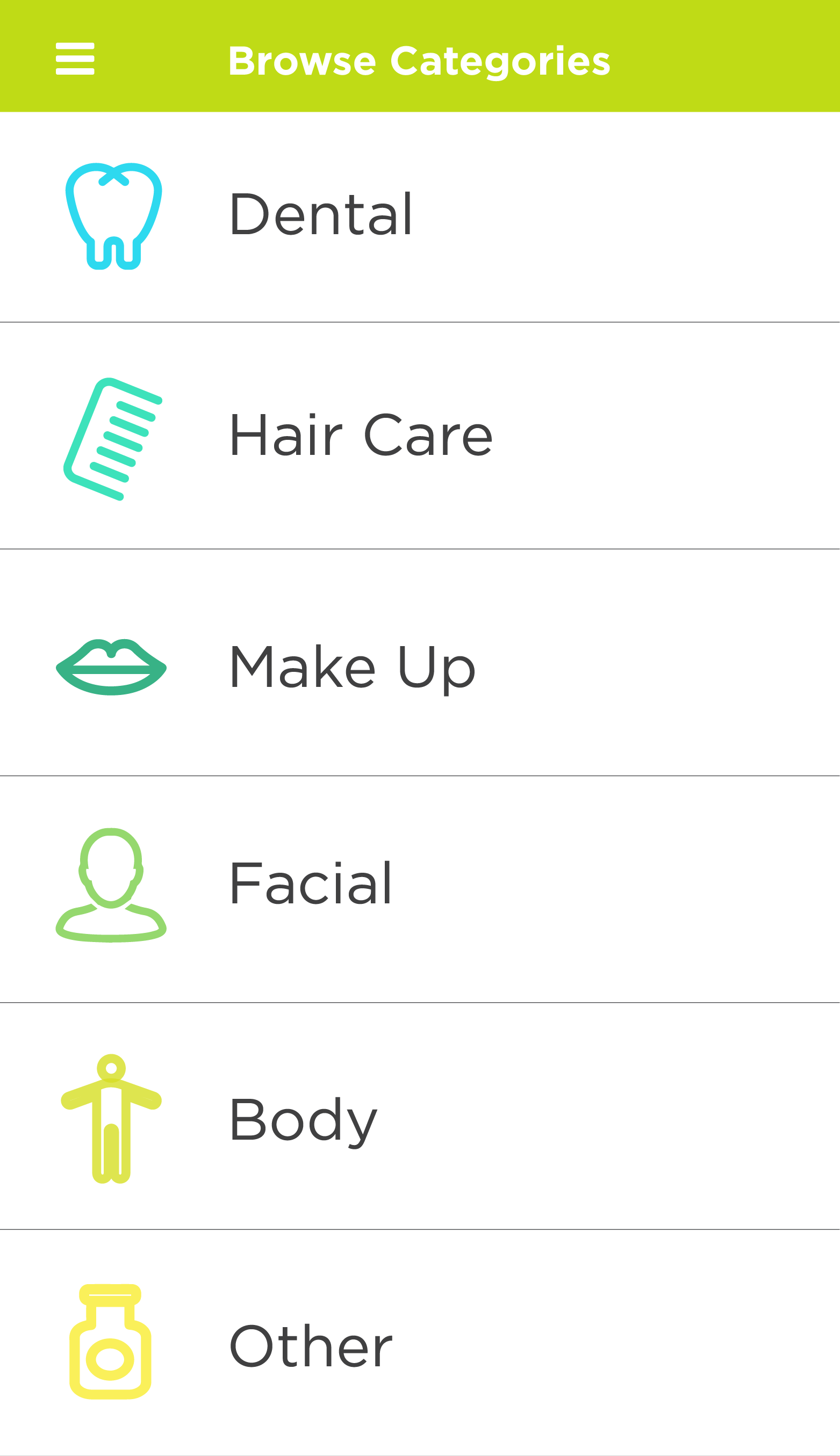
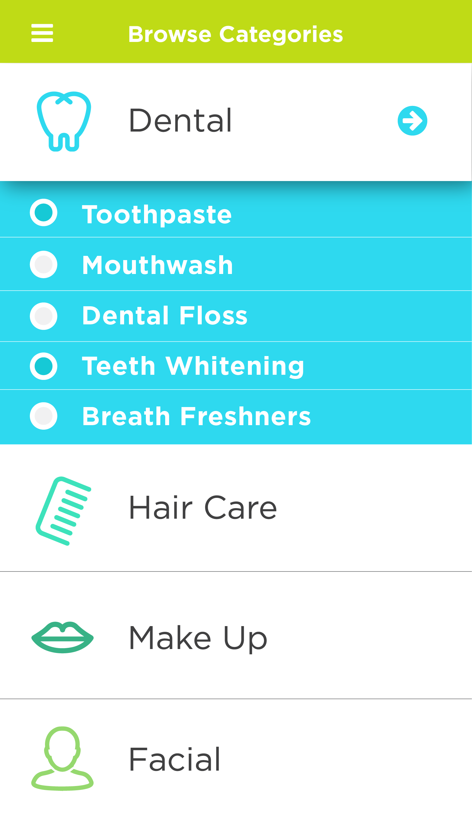
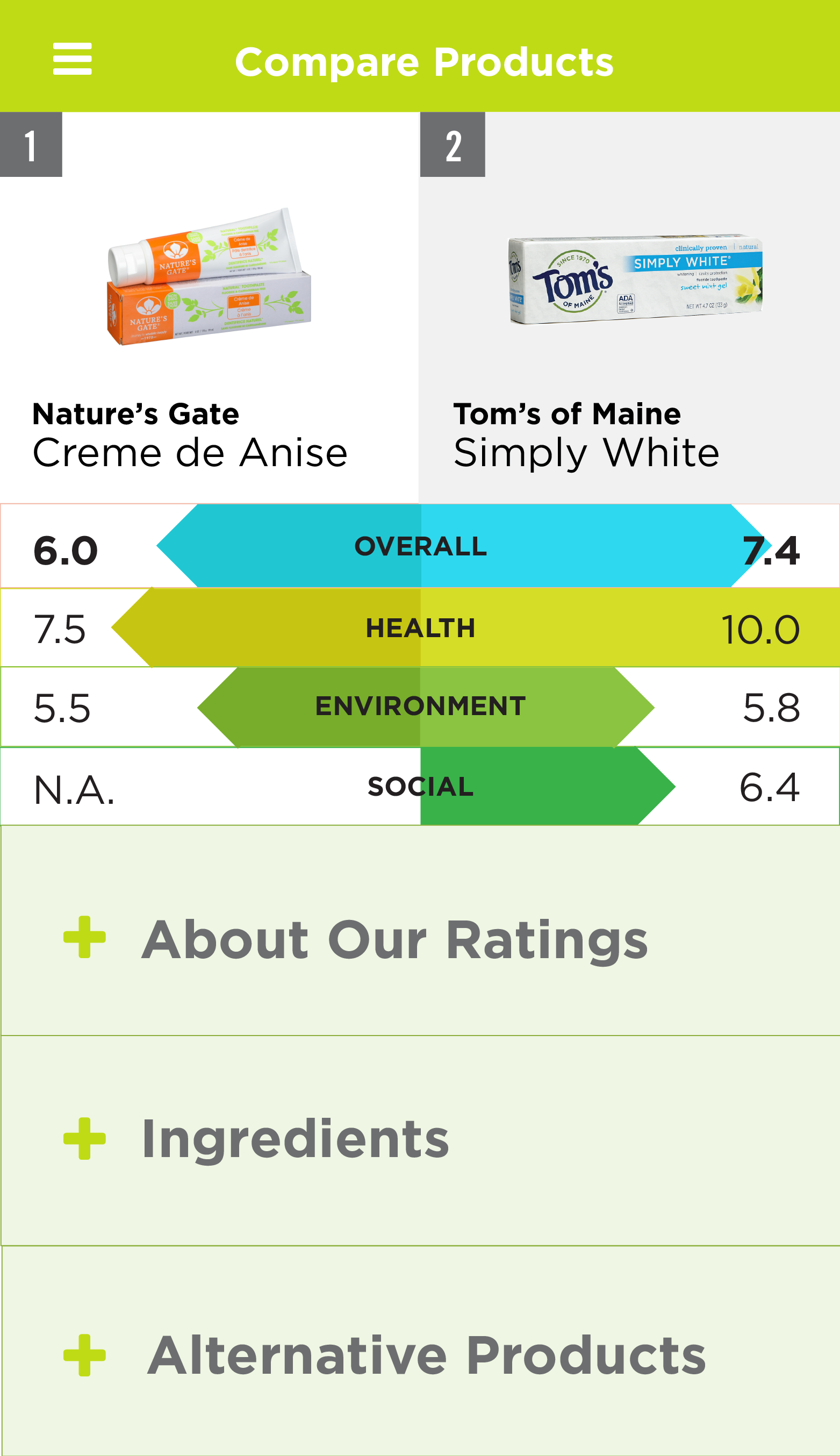
Green Owl also allows you to easily browse through a variety of products in its Browse Category feature. The shopper would have access to information about products that may be relevant to them. They can also compare items side by side so they can make the best, educated purchase. When a user selects an option from the different product categories, Green Owl then narrows their search by presenting a subcategory. Once they’ve been selected, the user can tap and select up two items to compare. If two items are selected, a button that asks the user to compare products shows up, and the user is then presented an infographic that shows stats of each product side by side that allows them to compare and make educated purchasing decisions.
|
|

|
|
| 1 | 2 | 3 | 4 |
| Category Page | Drop Down Subcategory for 'Dental' | Select Products to View or Compare | Screen Displays Comparison Chart |
Please view our process book to view the entire User Experience documentation.


