Ryte Onboarding and Dashboard Redesign
RELEASED
2021
ROLE
User Interviews,
User Journey Mapping, Wireframing, Prototyping, UITOOLS
Figma, Miro
Ryte is a web-based tool and all-in-one platform for website quality assurance and SEO. We give SEOs a holistic perspective of the overall health of their website, from addressing technical issues such as broken pages or redirects, giving legal compliance assistance under GDPR and providing performance analyses for their entire domain.
In late 2020, our business goals pivoted into prioritizing customer leads that come through our non-touch funnel, which included users who organically discovered our product, "untouched" by sales representatives. This meant that we needed to improve their onboarding process by showing the value of the Ryte tool clearly, leading them to purchase our "Basic" or "Business" packages and become happy, long-term customers.
Problem Statement
How might we show immediate value to the users who sign up for the tool, right from the get go?
As a company, we learned that our lead generation (10k~ new signups per month), was not converting well to long-term "Basic" or "Business" package users. Although our marketing efforts were working, it's clear that the users who land on our tool are unable to grasp the immediate value of signing up with Ryte. To them it's unclear what we can offer and how they can start using it as there is hardly any clear introduction in the tool. We also have the assumption that these users are not actually "high quality leads", meaning that a considerable amount of users who do sign up may actually NOT be our target users, resulting to a high churn rate per month.
Another point is that the mobile-friendly version of the tool is nonexistent. This reduces accessibility to nurture these leads, if they happen to browse through their mobile phones and want to sign up. It also contradicts the "mobile-first-indexing" focus that SEOs (our main target group) are very much aware of. In order to "walk the walk and talk the talk", Ryte must also show that it conforms to the user experience standards that we report to users within our tool.

Just like a new customer entering a brick-and-mortar store, first impressions and customer service matter a lot. It might even be the competitive edge that makes all the difference. As the designer, my goal is to replicate this inviting experience for our first time users.
Main Considerations:
- Improving the non-touch sales funnel through user experience
- Users understanding the value of Ryte from the very beginning using a form of personalization that acknowledges their needs and presents the appropriate content for them
- Redesigning the Dashboard, the first view that our users see of the tool
- Introducing Mobile Responsiveness for the first time
Process
1. Evaluating the User Flow
The Onboarding Process: Before the most prominent page - the dashboard - is seen by users upon their first sign up, the onboarding process is actually what takes them there. Along with our UX Working Student, I reviewed and analyzed the current onboarding experience and listed out the problematic parts of the user flow.
The Dashboard: I conducted a workshop along with my team's Product Owner to audit the current Dashboard design by figuring out what can be done in the MVP, assessing the technical feasibility of retrieving data from the backend, which elements and components can be reused from the Design System and which need improvement.
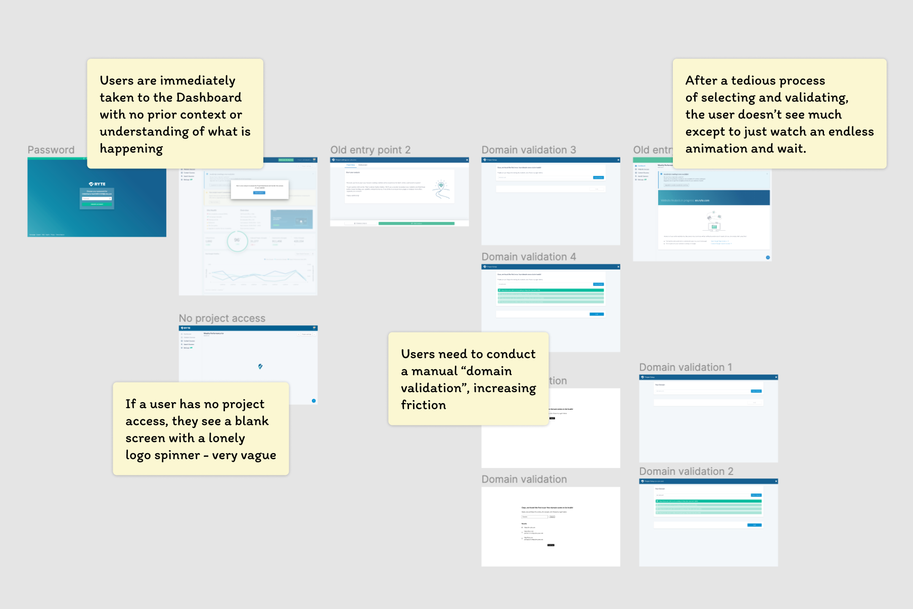
Evaluating the pain points that a user might face during the current onboarding.
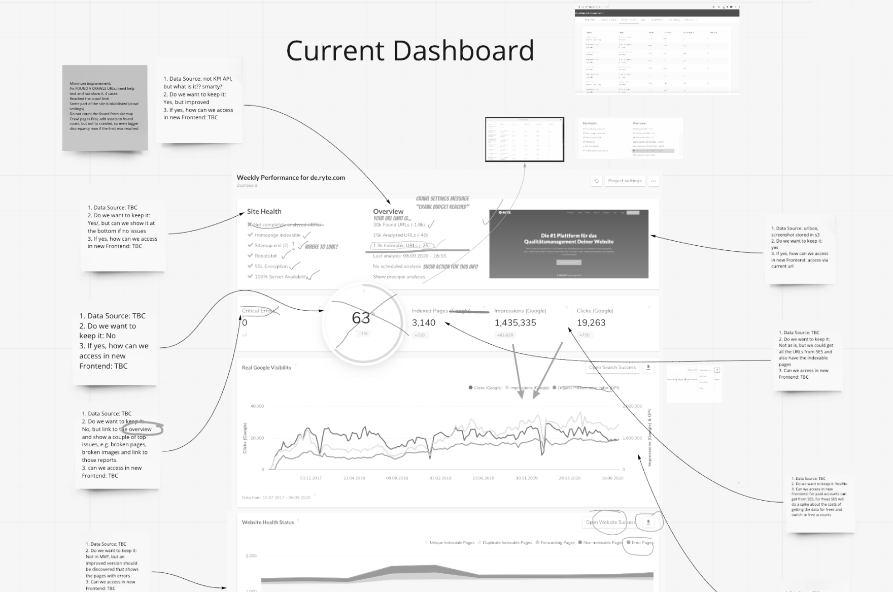
The messy but effective outcome of a Miro workshop with my team's product owner. Together we evaluated existing components in the Dashboard and their perceived user value, as well as noting down where each component's API would be derived from. This is especially helpful when discussing technical feasibility with our developers, who are new to the team and have to navigate through an unfamiliar legacy codebase.
2. Understanding the User's Perspective
How is the onboarding and dashboard experience perceived by actual users? I went to conduct a remote interview with a user who has previously signed up for Ryte but did not continue using the tool in order to understand what pain points they have and what aspects of the experience need clarification and improvement.
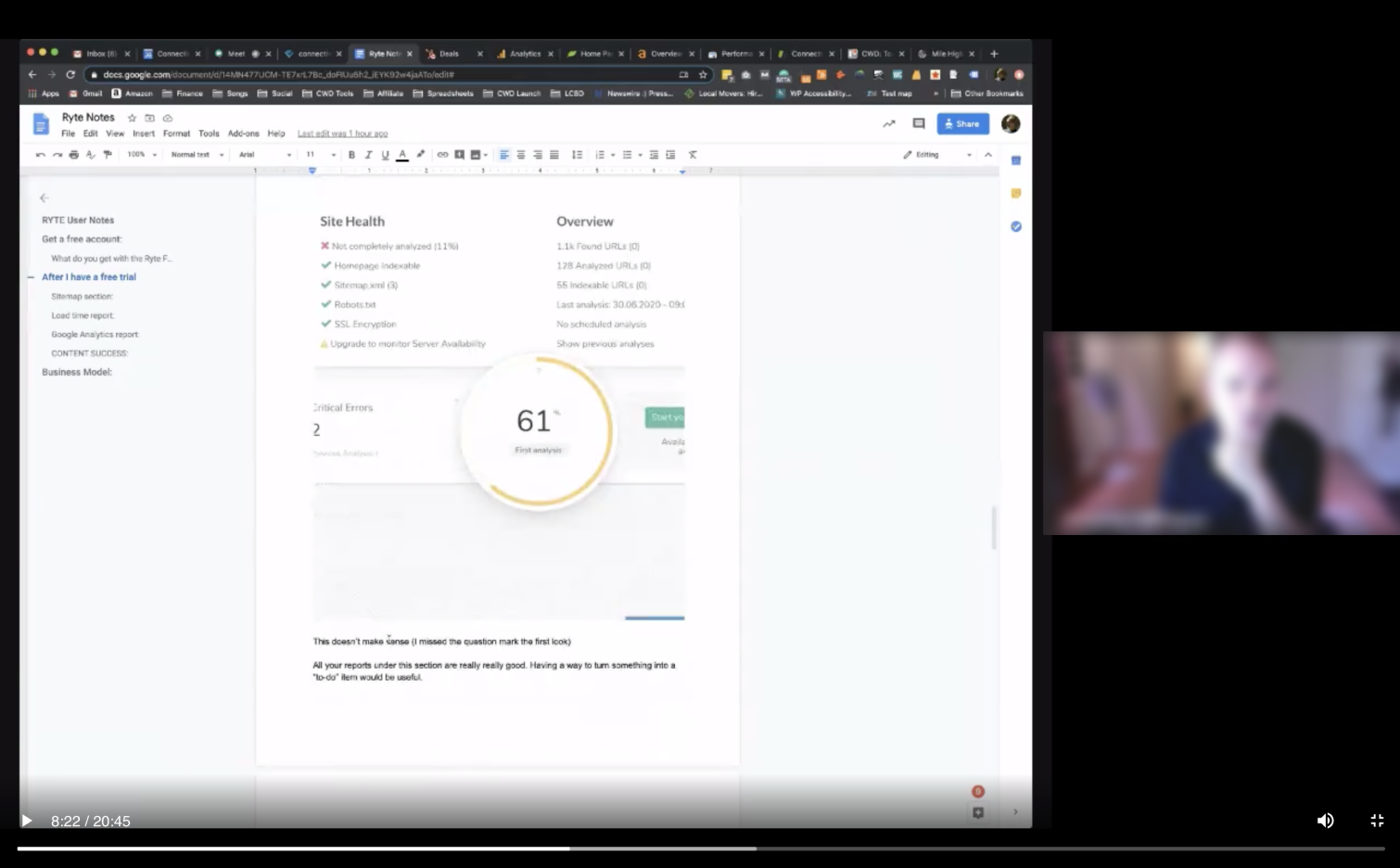
Remote user interview sessions with users in Los Angeles, CA.
3. Mapping out the User's Goals
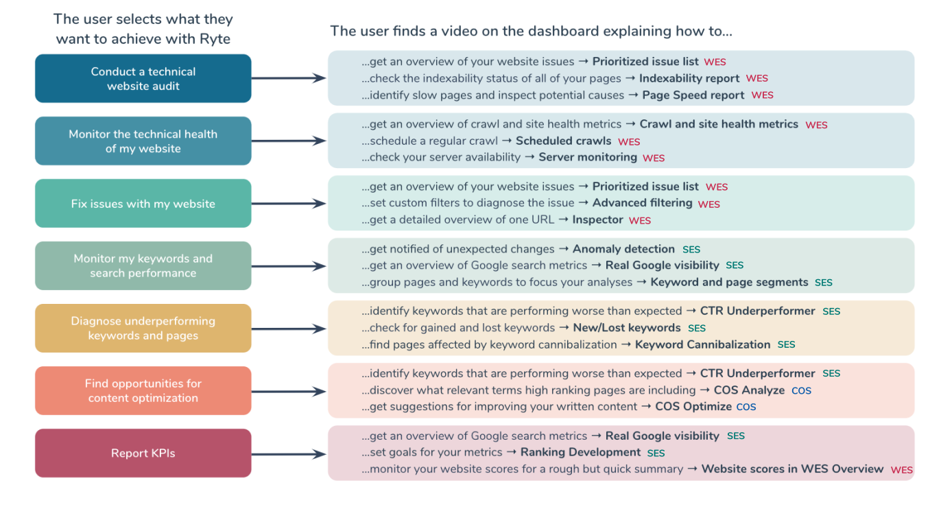
To address the problem of users not seeing the value that Ryte can provide on the get-go, I along with our UX Researcher, mapped the macro goals and micro use cases that a user might face, and evaluated what content and feature they need to be directed to.
4. Considering Business Needs
Since the goal is to improve the non-touch funnel and gain more quality leads and reduce churn, I needed to understand how our Business Development team sees what a "quality lead" looks like in order to identify them quicker and nurture their journey with enriched content that suits their needs.
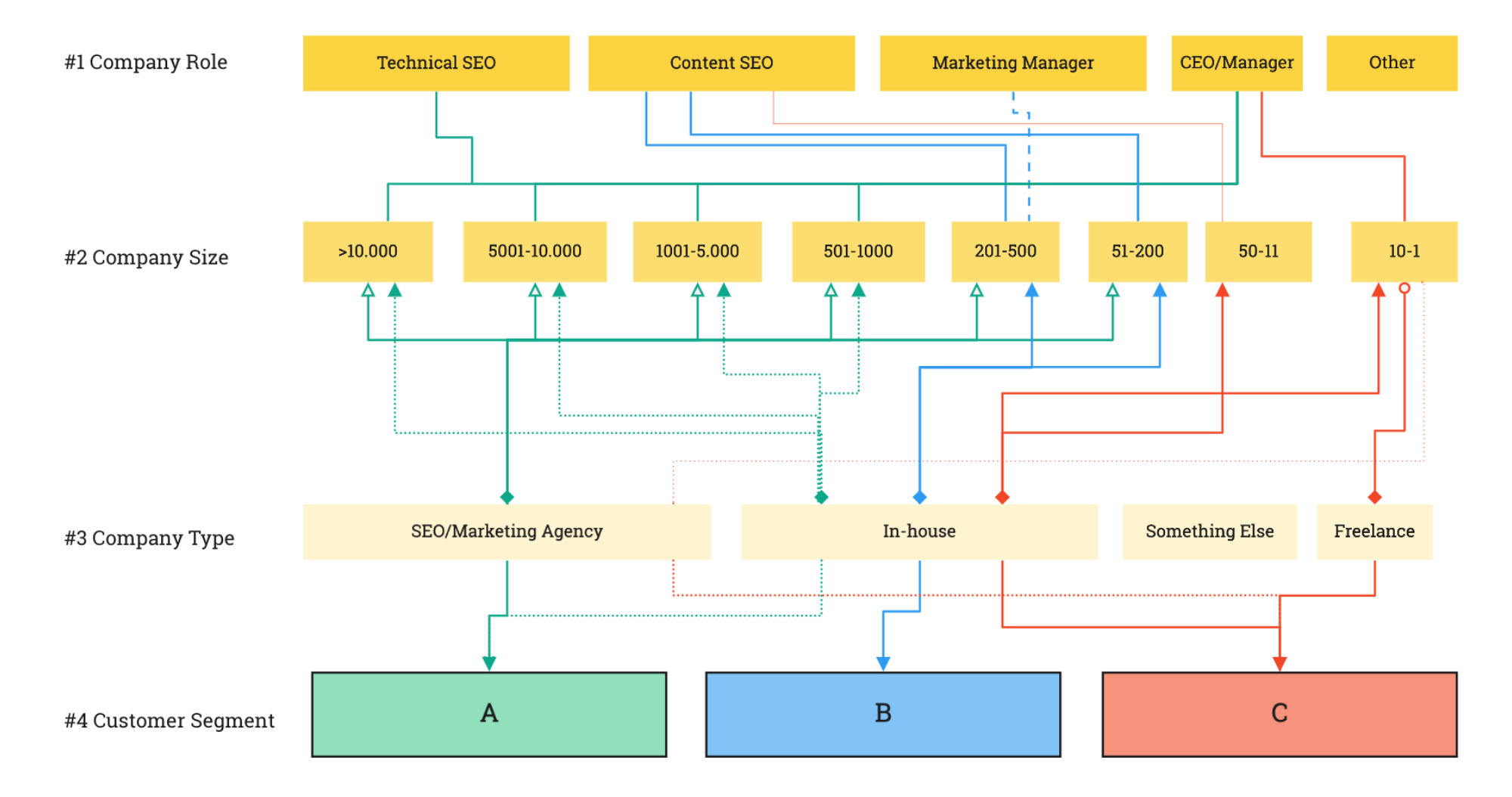
Defining the customer segmentation map informed the eventual structure of the questionnaire.
5. Wireframing
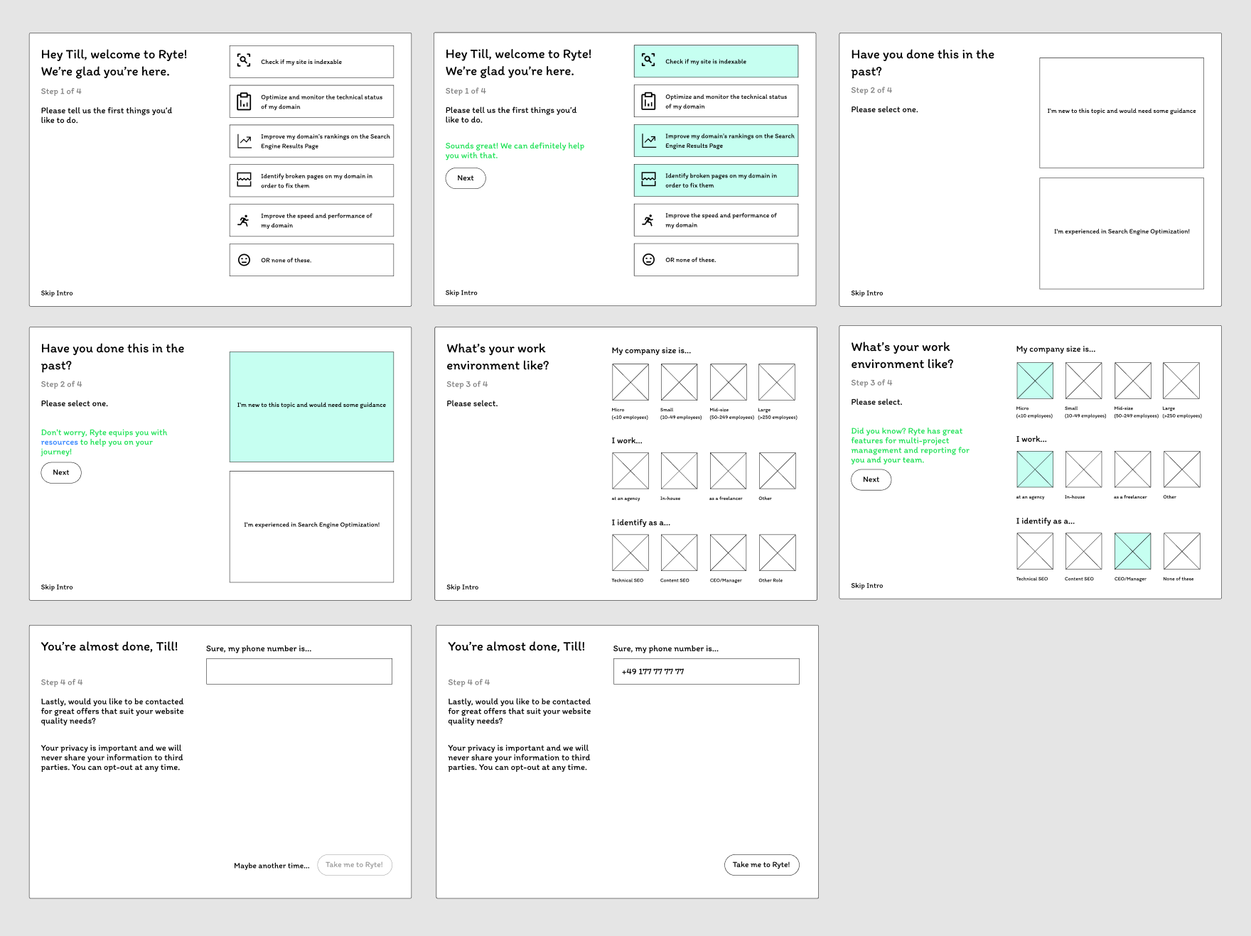
The idea of creating an onboarding process that understands users' needs strongly emerged as the direction we want to take. The onboarding would feature a questionnaire that gathers information from the user in order to curate a personalized experience. This would not only allow us to understand what our users need, it also helps us identify quality leads within the funnel.
Although this would lead to an extensive questionnaire, the tradeoff here is to make it as delightful as possible with the intention to lead users to content that matters to them depending on the choices that they selected.
The bigger question was how we would actually show the user value based off of these different macro use cases (goals)? We thought of using interactive coach marks and tooltips, but for the purpose of a faster release, we decided on using instructional videos featuring our team, which added a more personal touch when introducing our leads into the tool.
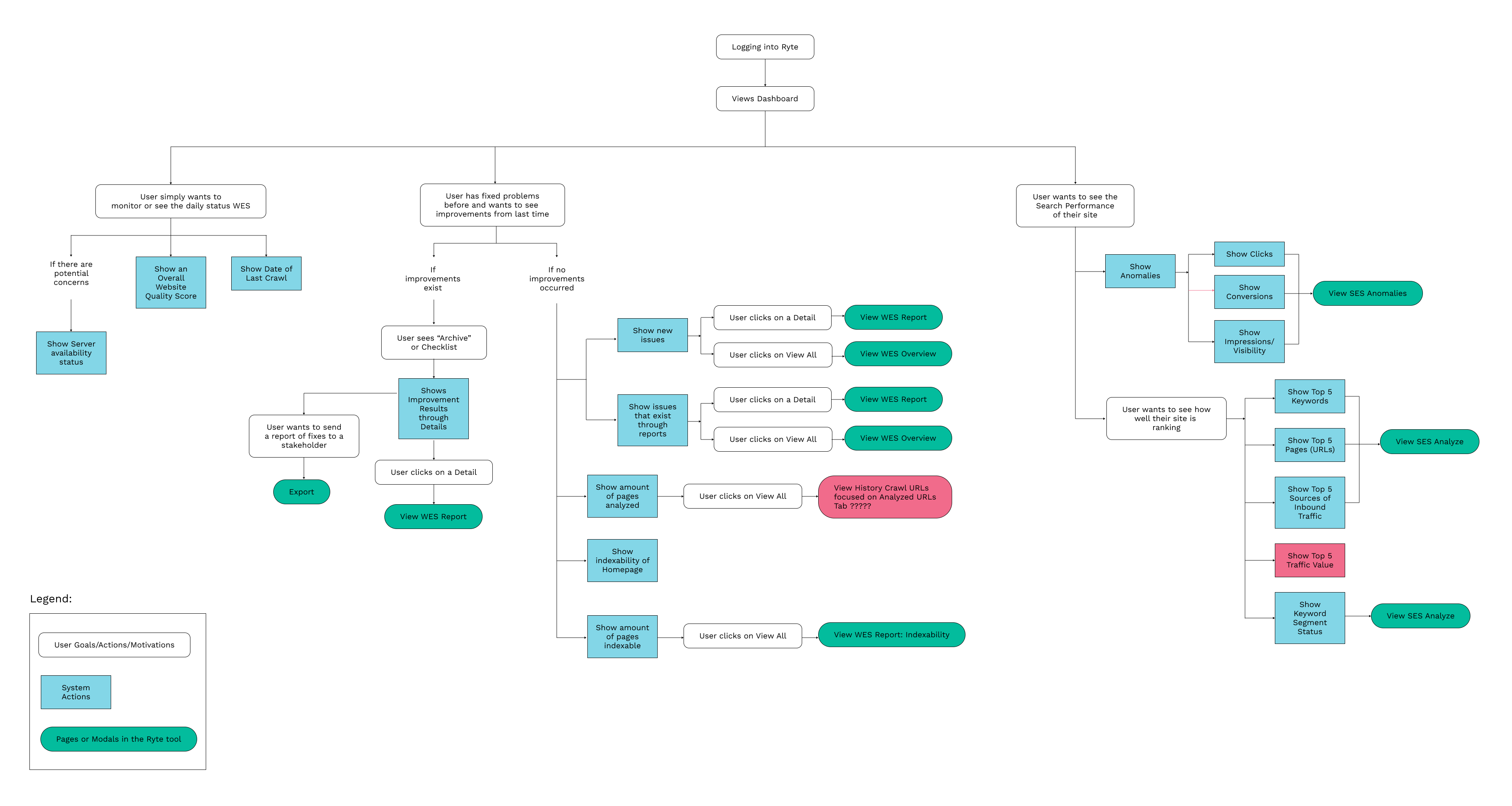
The dashboard, where the user would land after the onboarding process, also required a redesign. We then mapped out the userflow of the dashboard and created a mobile-first wireframe alongside a desktop version.
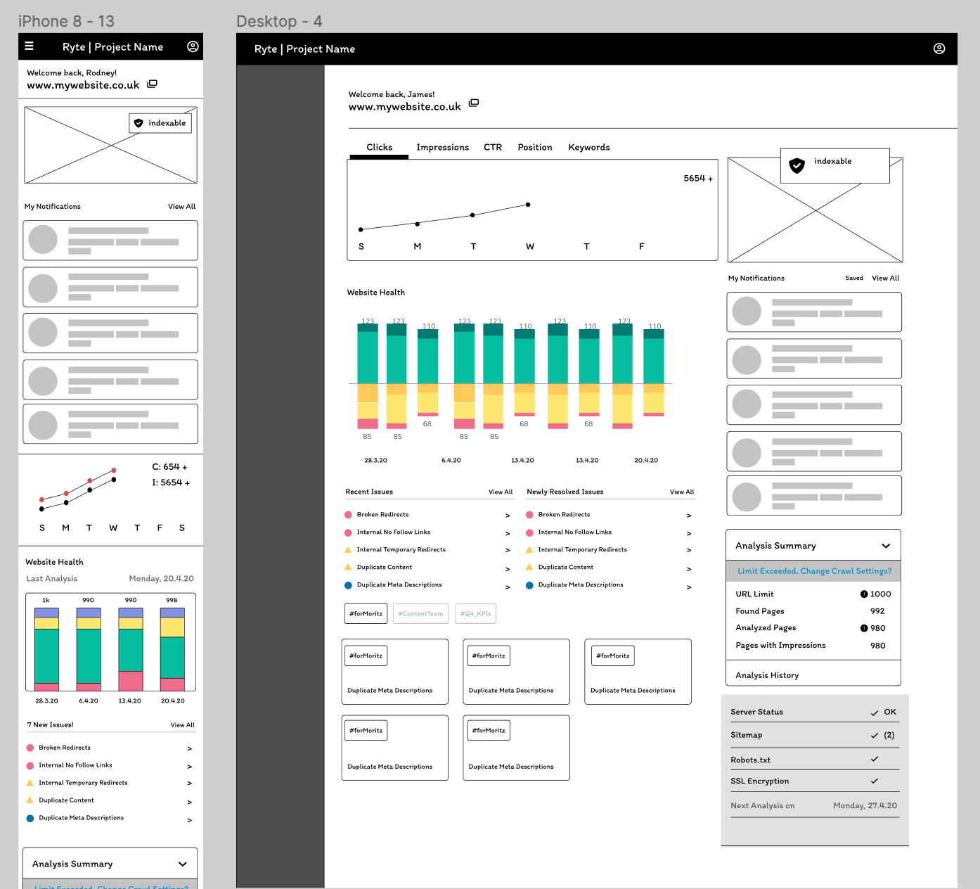
Early wireframes of the dashboard for mobile and desktop.
5. Prototyping and Mobile Usability Testing
After synthesizing our findings, mapping user goals to features and considering the business perspective, I created a prototype to present and test with 1 Content SEO Manager and 1 Tech SEO. The results were positively received which gave us the green light for development.
Solution
The new onboarding experience aims to not only take users into the tool after signing up. It also aims to communicate the value that Ryte can offer and tailor it to what our users actually need right from the very beginning: from the questionnaire survey that personalizes a users' experience, to the relevant content they see once they land in the dashboard.
Our developed MVP was a huge improvement from our previous user experience as it now took consideration of what content users would find valuable and therefore leading them directly to those areas, as well as eliminating vague and confusing moments during the onboarding process.
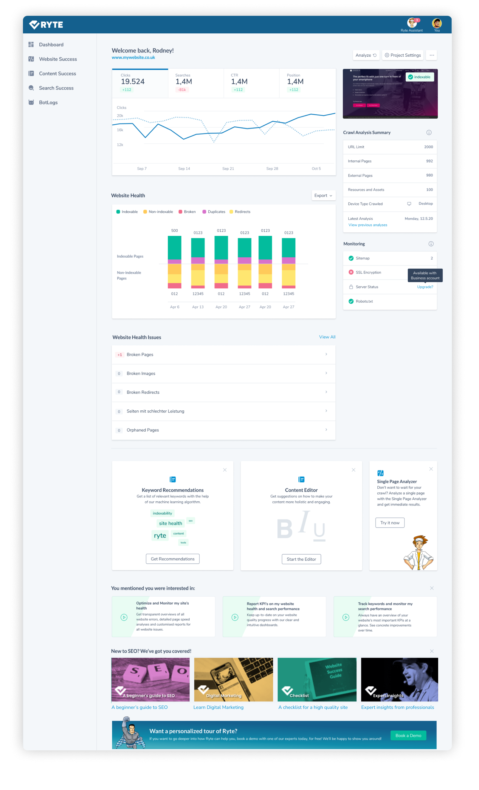
Since it's release early this year (Q1 2021), we've received positive responses about the redesign on social media and will continue to make improvements.
Learnings and Outcomes
- Considering Business needs along with User needs was a challenge.
This project made me realize that motivation between these parties clash and the job of the designer is to pick your battles until you get to a compromise. Although the MVP did not include small moments of freedom to the user as initially proposed due to business decisions made, in the future it would be ideal to have the Skip Questionnaire possible, but then we can prompt our users again after X days of tracked log-ins and usage. This added level might even help us identify higher quality leads vs. those filling out the questionnaire with random answers just to finally get to the tool. - Learning how to work cross-team in a remote setting!
With workshops, diligent documentation and close alignment through Slack channels, the correspondence really put everyone in the same page and the team collaboration was very successful. - The importance of numerous user input.
This was challenging because it was hard to recruit the right users due to availability, language constraints and lack of response. More insights could be discovered from more sources. Currently, the team is working on a way to recruit users to provide user insights easily in the future. - Alignment in every stage with the developer team is important.
For this project, alignment with developers mostly came towards the end of the process. With less touchpoints, improvement topics such as accomodating another breakpoint were not attended to on time before release. In order to continue this, the team now has regularly scheduled meetings for alignment topics per week.

